Sharon Styer and Gail Ramsey Wharton
By Alec Clayton
I recently wrote about collage artists Sharon Styer and
Gail Ramsey Wharton for Oly Arts (see CreativeMinds: The Collage Art of Sharon Styer and Gail Ramsey Wharton). Since writing that article, I have had
additional thoughts about their work that I’d like to share.
 |
| Collage from Food for Thought series by Gail Ramsey Wharton |
 |
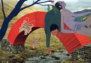
| “What she really wanted was to just stop worrying” collage by Sharon Styer |
Poet Isidore-Lucien Ducasse, writing
under the nom de plume Comte de Lautréamont, penned the line "as beautiful
as the chance encounter of a sewing machine and an umbrella on an operating
table," and André Breton adopted that line as a guiding principle of
Surrealism. The beauty of chance, and the strange wonder of juxtapositions of disparate
objects. That is in essence a description of both Dada and Surrealism and of collage
as medium and as a method of design. It has been paramount in the works of
artists from Picasso and Braque to Duchamp, to Jasper Johns to David Salle.
Collage, in fact, has been the design method of just about every art since
Picasso and Braque first glued imitation wood grains into their paintings—whether
or not the actual gluing of paper or other materials is involved.
Collage as a method of design is not
hierarchical. There is no main character centerstage with smaller supporting
cast off to the sides such as in the typical Renaissance triangular
composition. Rather, all characters, images, shapes tend to be of equal value.
Rules of perspective are often ignored. There are realistic images because the
images tend to be taken from photographs ripped from the pages or newspapers
and magazines, but the relationships of the various images are often
unrealistic. Parts of bodies don’t match. Background images may be larger than
foreground images. Collages are narrative by nature, but the narratives are
more implicit than explicit. If there are stories, they are stories with no
logical beginning, middle and end.
A collage from Gail Ramsey Wharton’s “Food for
Thought” series pictures an androgynous figure in an interior setting seated on
an antique chair. There’s something strange and comical about the figure, and
about the entire scene. For starters, the figure’s head is way too large for
the body. And for quite some time I thought of the figure as a woman, but
eventually noticed that her (or his) chest is bare and does not look like a
woman’s breast, and he’s wearing long stockings and men’s pointy-toed saddle
oxford shoes. And there are things in that room that do not belong (as out of
place as the sewing machine and umbrella on a dissecting table). He or she is
eating an apple, there’s a snake coiled around the chair leg, and there’s a
peeping Tom at the window who looks like popular images of Jesus. And then it
dawns on me: it’s Adam (or Eve) in the Garden of Eden, but the garden is a
Victorian era bedroom, and if that’s God watching over him or her, he’s a very
creepy god. Quite often art is both upsetting and funny.
A friend of mine owns another Ramsey
Wharton collage. It pictures a woman riding an ironing board as if it is a
surfboard. I’ve often enjoyed looking at it, but it only recently dawned on me
that the artist’s turn of mind in noticing that an ironing board is shaped like
a surfboard and coming up with the quirky idea of putting a surfing woman on it
is akin to the kind of thinking Picasso must have done when he combined a
bicycle seat and handlebar to make a sculpture of a bull.
Collage artist Sharon Styer’s “What
she really wanted was to just stop worrying” is a languid, pastoral scene with
a pair of lovers reclining on a bridge. The scene is a surrealistic mix of
photographs and images cut from paintings. The landscape is a photograph—all
but the blue tree in the foreground, which is painted in a single, flat color,
as are the clothes and the bodies of the man and woman. Pop Art images with a
hint of Asian art. The man is clothed in a blue suit, and the woman is naked.
Her flesh is purple. Even though her head and shoulders rest on his body, they
seem unattached and uninterested in one another. The bridge they rest upon is
an arch of something like a Japanese paper lantern. The bridge and the man and
woman are gigantic in relation to the landscape. By comparison to the size of
the bodies, the creek is a mere trickle only a few inches wide. No bridge
should be needed to cross it.
Much of the beauty of “What she
really wanted was to just stop worrying” is in the movement of lines, the bend
of the tree that mimics the shape of the bridge and the sensual lines of the
people’s bodies, particularly the position of their arms. Every edge, every
line, directs the viewers’ eyes in lyrical movement across the surface. And there
are butterflies. There is clearly a story behind this picture. We want to know
what they are doing and why, how they got there and what is going to happen
next.

No comments:
Post a Comment